

Angular Material 2 Demo App
Angular Material 2 comprehensive, modern UI components that work across web, mobile and desktop. They are built on Material Design concepts. They are built with Angular 2 team.
One important point to notice even though its built by Angular 2 team, it's not part of packages required for building Angular 2 i.e. its treated as 3rd party package to be integrated. Recommend to go through Github repo
For styling Angular 2 apps, we can use Bootstrap, Semantic UI, its not mandatory to use material design. Angular Material 2 components have more features apart from styling.
We will be adding these Material 2 components into Angular 2 application created using Angular CLI, we will continue from Build Angular 2 apps using CLI
Remember Angular CLI is not the only way to create Angular 2 apps & add Material 2 components
Update package.json to Angular Material 2 package
From the project root directory (same directory as package.json), run the following command to install Material 2 packages as well update package.json
// Run from command line npm install --save @angular/material
Adding hammer.js to package.json
The slide-toggle and slider components have a dependency on HammerJS. You need to run this to ensure everything builds properly.
HammerJS support touch gestures to web pages
// Run from command line npm install --save hammerjs
Using Material Icons and per-built theme
If you are interested in adding Material icons using md-icon in html pages, we need to include link them. Angular CLI uses Webpack to build, compose run application, it becomes much easier to add it.
Angular Material comes with per-built theme when installing packages, this can be added too. Both md-icon and pre-built theme are optional
Open src/styles.css, then add the following code in this file
/* You can add global styles to this file, and also import other style files */ @import '~https://fonts.googleapis.com/icon?family=Material+Icons'; @import '[email protected]/material/core/theming/prebuilt/deeppurple-amber.css'; body { margin: 10; font-family: Roboto, sans-serif; } Include Material Module
Angular 2 uses @NgModule for declaring components, importing modules, services as providers etc. We need to import material module to be used across the application. Refactoring to Material Module is good approach compared previous approach.
Add highlighted code into src/app/app.module.ts. This will import material components using webpack
import { BrowserModule } from '@angular/platform-browser'; import { NgModule } from '@angular/core'; import { FormsModule } from '@angular/forms'; import { HttpModule } from '@angular/http'; import { PlanetsService } from './shared'; import { MaterialModule } from '@angular/material'; import { AppComponent } from './app.component'; @NgModule({ declarations: [ AppComponent ], imports: [ BrowserModule, FormsModule, HttpModule, MaterialModule.forRoot() ], providers: [PlanetsService], bootstrap: [AppComponent] }) export class AppModule { } Material components in HTML
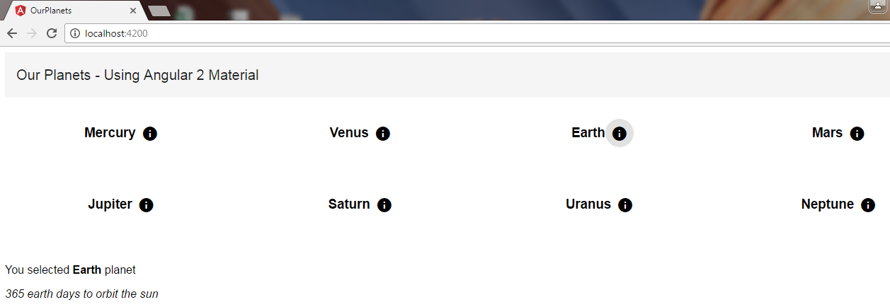
Open src/app/app.component.html, add following code – we are using md-toolbar, md-grid-list, md-grid-tile to show planets as tiles.
<md-toolbar> Our Planets - Using Angular 2 Material </md-toolbar> <md-grid-list cols="4" rowHeight="100px" > <md-grid-tile *ngFor="let planet of planetsList" > <h3 md-line>{{planet.name}}</h3> <button md-icon-button (click)="showPlanetInfo(planet)"> <md-icon>info</md-icon> </button> </md-grid-tile> </md-grid-list> <br> <p>You selected <b>{{selectedPlanet.name}}</b> planet</p> <i>{{selectedPlanet.description}}</i> Then open src/app/app.component.ts, it just loads planetslist, assign new planet member, showPlanetInfo method just assign selected planet to be shown on UI.
Clicking on the info icon, it will show planet details in bottom
import { Component, OnInit } from '@angular/core'; import { Planets, PlanetsService } from './shared'; @Component({ selector: 'Planets-root', templateUrl: './app.component.html', styleUrls: ['./app.component.css'] }) export class AppComponent implements OnInit { planetsList: Planets[] = []; selectedPlanet: Planets; constructor( private _planetservice: PlanetsService) {} ngOnInit() { this._planetservice.getPlanets().then(planets => this.planetsList = planets); this.selectedPlanet = new Planets(); } showPlanetInfo(selplanet) { this.selectedPlanet = selplanet; } } Now that we have adding Material 2 package, imported them, included them in HTML, lets do ng serve to see them on web page as seen below
It's very easy now to include Angular Material 2 components in Angular 2 application.
Angular Material 2 Demo App
Source: https://mithunvp.com/angular-material-2-angular-cli-webpack/
Posted by: biscoecloons1986.blogspot.com
0 Response to "Angular Material 2 Demo App"
Post a Comment